How to Build a Custom Dashboard for Any Business Process — Without Writing Code
2026-05-09
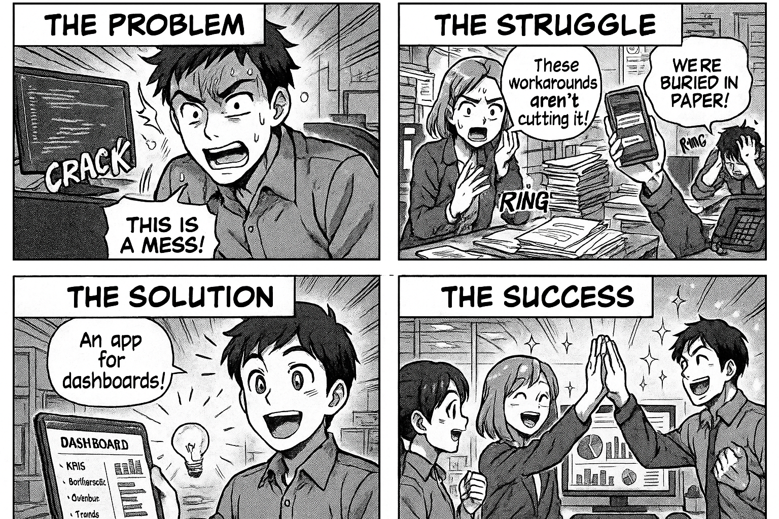
Build dashboards that show KPIs, bottlenecks, overdue items, and trends for any business process — generated from your workflow data automatically.
You built a workflow. People are using it. Data is flowing. But nobody sees the big picture.
The production manager wants to know how many POs are overdue. The QA head wants to see pending test reports. The CEO wants a completion rate trend. Everyone asks, and someone opens Excel.
What if the dashboard built itself from the data already in your workflow?
What a Process Dashboard Shows
Every workflow has stages. Every stage has entries. From this alone, you get:
1. Pipeline View
How many entries are at each stage right now?
| Stage | Count |
|---|---|
| Request Submitted | 12 |
| Manager Approval | 5 |
| In Process | 23 |
| QC Check | 8 |
| Completed | 340 |
Instant visibility. No report compilation.
2. Bottleneck Detection
Which stage takes the longest?
| Stage | Avg Days |
|---|---|
| In Process | 14.7 days |
| QC Check | 1.2 days |
| Manager Approval | 0.5 days |
If "In Process" takes 15 days while everything else takes 1 day, that's your bottleneck. You don't need a consultant to tell you this — the data shows it.
3. Overdue Items
Which entries have crossed their deadline?
If your workflow captures a delivery date or expected completion date, the dashboard compares it with today. Past due = overdue. Color-coded: red (>2 weeks), amber (1-2 weeks), yellow (<1 week).
Click any overdue item to open it directly.
4. Completion Trends
Are you getting faster or slower?
Monthly chart showing entries created vs completed. If the gap is growing, you're falling behind.
5. Who's Doing What
Per-person performance:
- Tasks completed this month
- Average time per task
- Current workload (open tasks assigned)
Not for surveillance — for capacity planning. If one person has 50 pending tasks and another has 3, rebalance.
How It Works in Flobri
Step 1: Build Your Workflow
Describe your process. Flobri generates the stages, forms, transitions, and assignments.
Step 2: Use It
People submit requests, approvals happen, work gets done. Every action is tracked with timestamps.
Step 3: Dashboard Appears
The chat builder asks: "Want me to build a dashboard?" Say yes. Describe what you want to see — or let it auto-generate based on your workflow structure.
The AI knows your stages, fields, and data. It builds:
- KPI cards (clickable)
- Pipeline charts (donut, bar)
- Trend lines (monthly/weekly)
- Detail grids (sortable, filterable)
- Overdue alerts (color-coded)
- PDF downloads
Step 4: Refine Through Chat
"Add a vendor-wise breakdown."
"Show only items from this month."
"Make the overdue section more prominent."
Each instruction updates the dashboard. Keep refining until it matches what management needs.
Real Examples
Purchase Order Dashboard
- 267 open POs
- 140 overdue (5 critical >2 weeks)
- Bottleneck: In Process stage (14.7 days avg)
- Top products by PO count
- Vendor delivery performance
QC Alert Dashboard
- 84 pending QC samples
- 4 open >15 days (critical)
- Breakdown by company
- Days pending color-coded
Raw Material Stock Dashboard
- Bags in store per material
- Daily in/out movement
- Audit comparison (expected vs counted)
- Alert when audit overdue >3 days
No Code Required
The dashboard is generated from your workflow data. You don't write SQL. You don't design charts. You describe what you want in plain English, and the system builds it.
Go to insights.flobri.com/chat-builder and try it.
Flobri auto-generates dashboards from your workflow data — KPIs, bottlenecks, overdue alerts, trends, and detailed grids — all through a chat interface with no coding required.