What a CEO Dashboard Should Actually Show You
2026-05-03
Most CEO dashboards show what happened last quarter. A useful dashboard shows what needs your attention today. Here's what to build.
What a CEO Dashboard Should Actually Show You
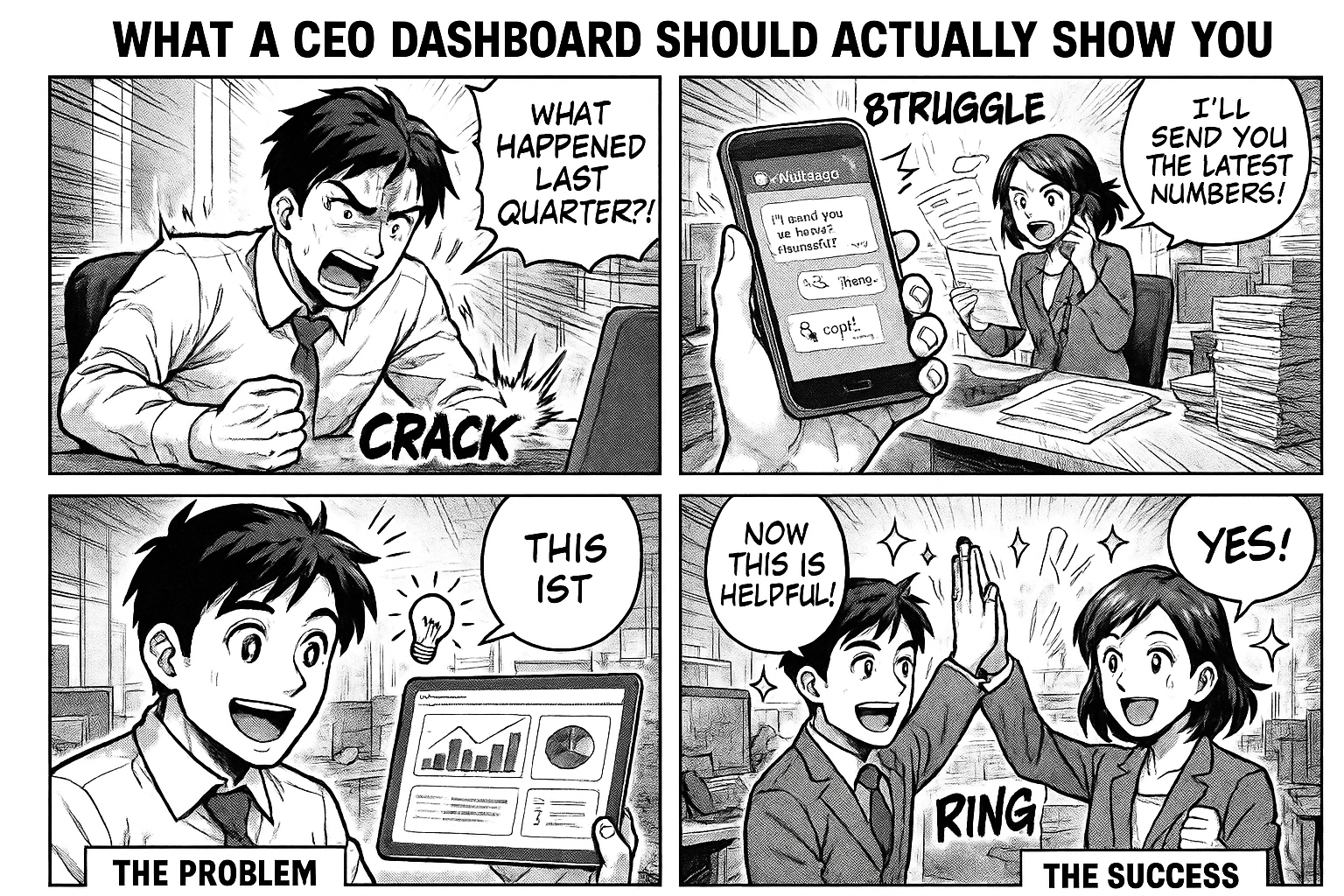
Most CEO dashboards are useless. They show you what happened last quarter in pretty charts. By the time you see the data, it's too late to act.
A useful CEO dashboard shows you what's happening right now — and what needs your attention today.
What Most Dashboards Get Wrong
Too Much Data, Too Little Insight
Revenue by month. Expenses by category. Headcount by department. Employee attendance percentage. Twenty charts, zero actionable information.
A CEO doesn't need to know that attendance was 94.3% last month. A CEO needs to know that 5 purchase orders are delayed beyond lead time and production will stop in 3 days if they're not resolved.
Backward Looking
Historical data has its place — in board meetings. Your daily dashboard should be forward-looking:
- What's stuck?
- What's overdue?
- What needs my decision?
- What's about to become a problem?
Requires Manual Compilation
If someone has to "prepare the dashboard" every morning, it's not a dashboard — it's a report. By the time it reaches you, it's already stale.
A real dashboard updates itself. Every time an employee processes a PO, completes a QC test, or closes a maintenance ticket, the numbers change.
What Your Dashboard Should Show
1. Process Pipeline
For every critical process, show the pipeline:
Purchase Orders: 5 pending approval → 8 sent to vendor → 2 delayed → 3 in QC → 12 completed this week
Maintenance: 3 new tickets → 5 in progress → 2 waiting for parts → 8 closed this week
Quality: 4 samples pending → 2 being tested → 1 failed → 10 approved this week
Each number is clickable. Click "2 delayed" → see exactly which POs, which vendors, how many days overdue.
2. Attention Items
Red flags that need action today:
- 3 purchase orders delayed beyond lead time (INR 4.5 lakhs at risk)
- 1 maintenance ticket open for 15 days (Machine #7, production impact)
- 2 QC failures on Vendor X materials (third time this quarter)
- 5 leave requests pending approval for more than 2 days
These aren't reports. These are calls to action.
3. People Performance
Not employee surveillance — operational efficiency:
- Which managers approve POs fastest? (Avg 2 hours vs 3 days)
- Which department has the most stuck items?
- Who's overloaded? (15 pending tasks vs average of 5)
4. Trends That Matter
Not vanity metrics — leading indicators:
- PO volume up 30% this month — is procurement capacity keeping up?
- QC rejection rate doubled — is it a vendor issue or a specification change?
- Maintenance tickets increasing — is equipment aging?
- Average cycle time getting longer — where's the bottleneck?
5. Cross-Process Visibility
Processes don't exist in isolation:
- Delayed PO → material shortage → production delay → missed delivery
- QC failure → reorder → vendor delay → production reschedule
Your dashboard should show how processes connect. Which vendor's delays are affecting which production schedules?
The Flobri Approach
In Flobri, the dashboard isn't a separate product. It's a natural consequence of running your processes through the system.
Automatic KPIs
The moment you deploy a workflow, you get KPIs:
- Active entries by stage
- Completed vs pending
- Average cycle time
- Stuck items (overdue beyond threshold)
No configuration. No report builder. No BI tool.
Knowledge Brain
Click "Knowledge Brain" and see your entire operation:
- Overview: SOPs count, active entries, completed, stuck
- Process Health: cycle time, bottleneck analysis, top/slow performers
- Trends: week-over-week changes, anomaly detection
- Relationships: how processes connect (PO → GRN → QC → Production)
Entity Intelligence
Click any vendor, product, or employee → see everything about them across all processes:
- Vendor "Sharma Chemicals": 45 POs, avg delivery 6 days, 2% rejection rate
- Product "Paracetamol": 12 batches, 3 QC issues, last dispatched March 15
- Employee "Raj Kumar": handles 15 active entries, avg response 2.1 hours
CEO Intelligence Briefing
Every morning, Flobri's AI analyzes your data and generates a briefing:
"3 POs delayed beyond lead time — all from Vendor X. This is the third month with delays from this vendor. QC rejection rate is up 8% — driven by raw material quality from Vendor Y. Recommend vendor review meeting."
Not a chart. A narrative. What happened, why it matters, what to do.
Start With Visibility
You don't need to implement everything at once. Start with one process — your most critical one. Deploy it in Flobri. Run it for a week.
Then open the dashboard and see what you've been missing.
Go to insights.flobri.com/build and describe your process. The dashboard comes free.
Flobri gives CEOs real-time visibility into operations — purchase orders, production, quality, maintenance, and HR — with AI-powered intelligence briefings and automatic dashboards.